Progress indicator redesign

A thorough process to develop a new progress indicator that can be adopted globally, from research to redesign.

Project introduction

Problems:

  1. The current design of progress indicator has received a mixed user feedback about its usability and the design team found the current component is limiting and cannot scale to properly indicate where users are in their process.

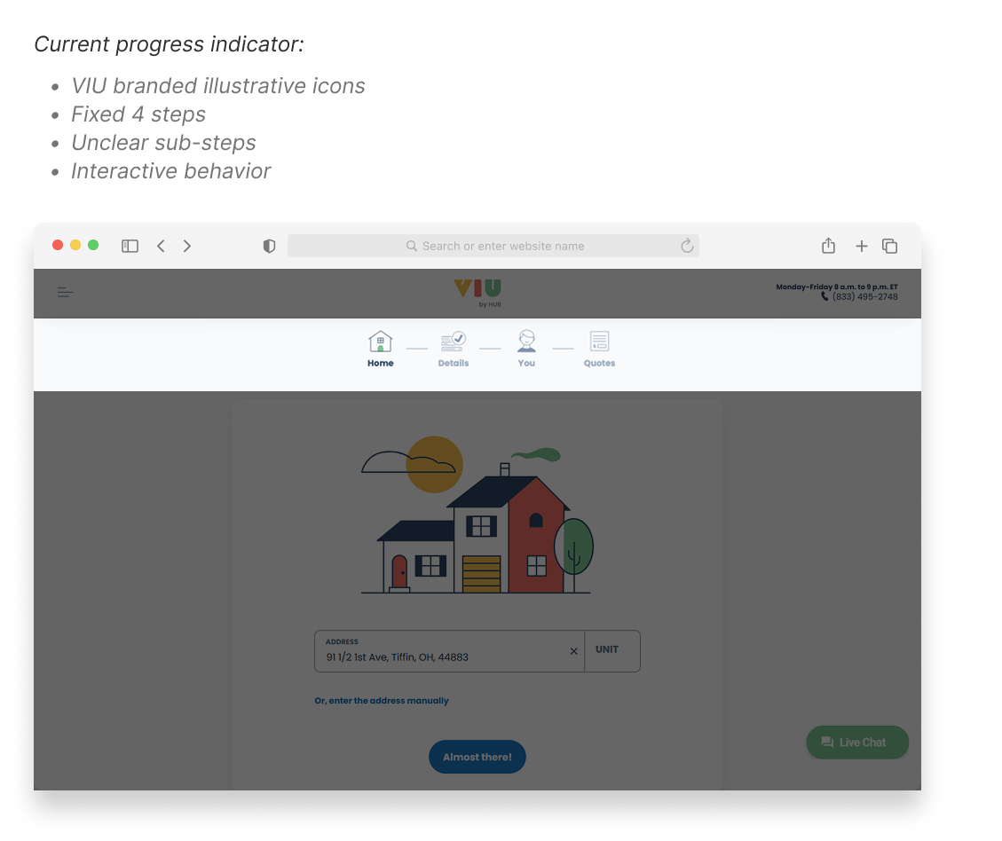
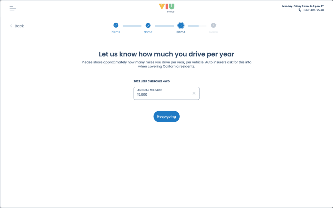
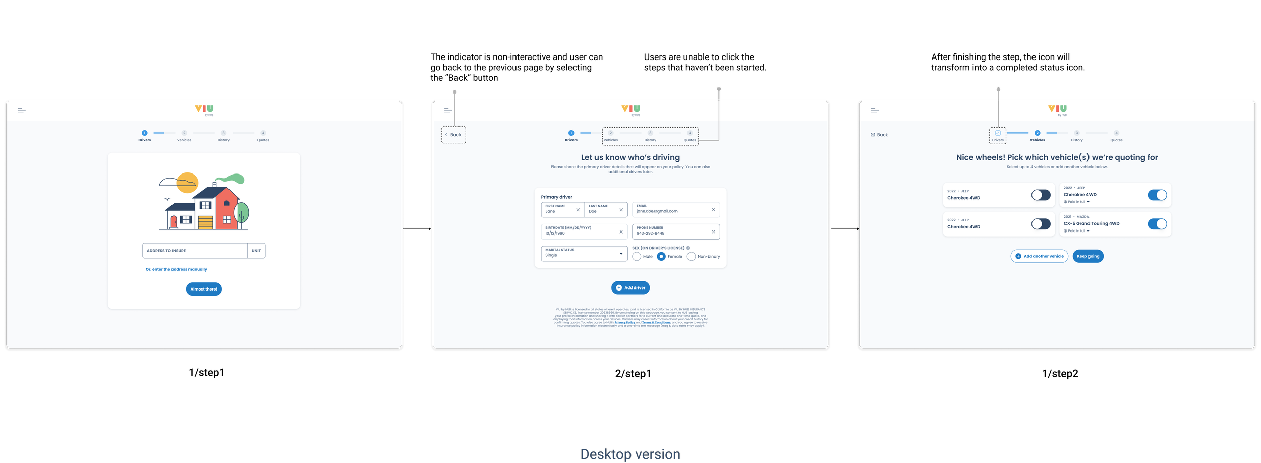
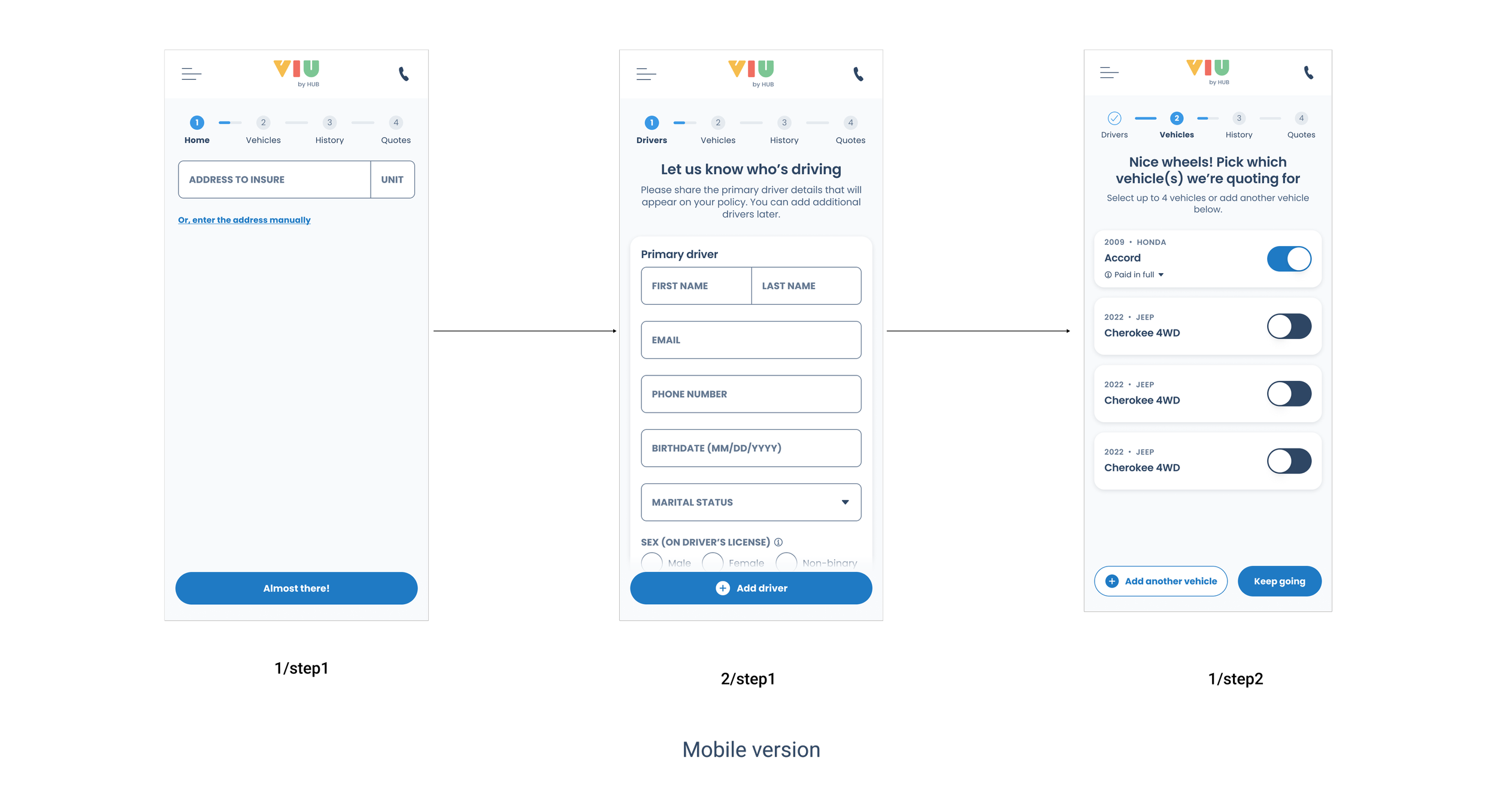
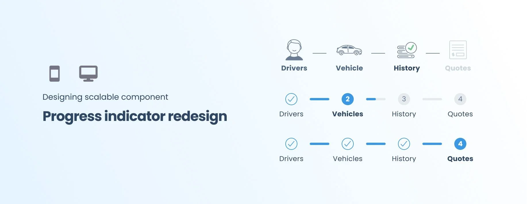
  2. The current component indicates a section of the process, but each section can be dynamic and each section may have multiple subsections.

  3. The process may be terminated when information provided prevents them from going further. This currently cannot be indicated in the component.

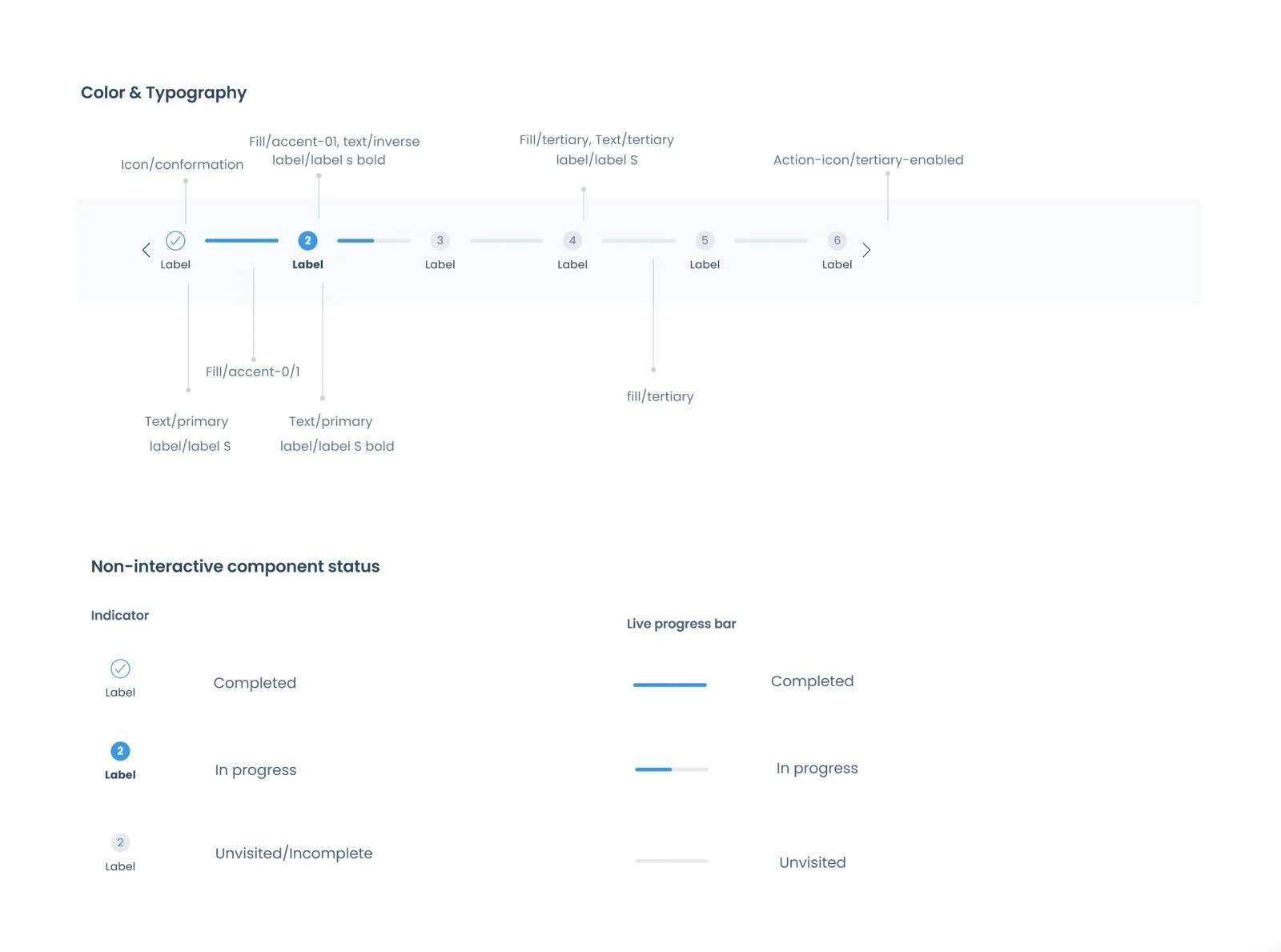
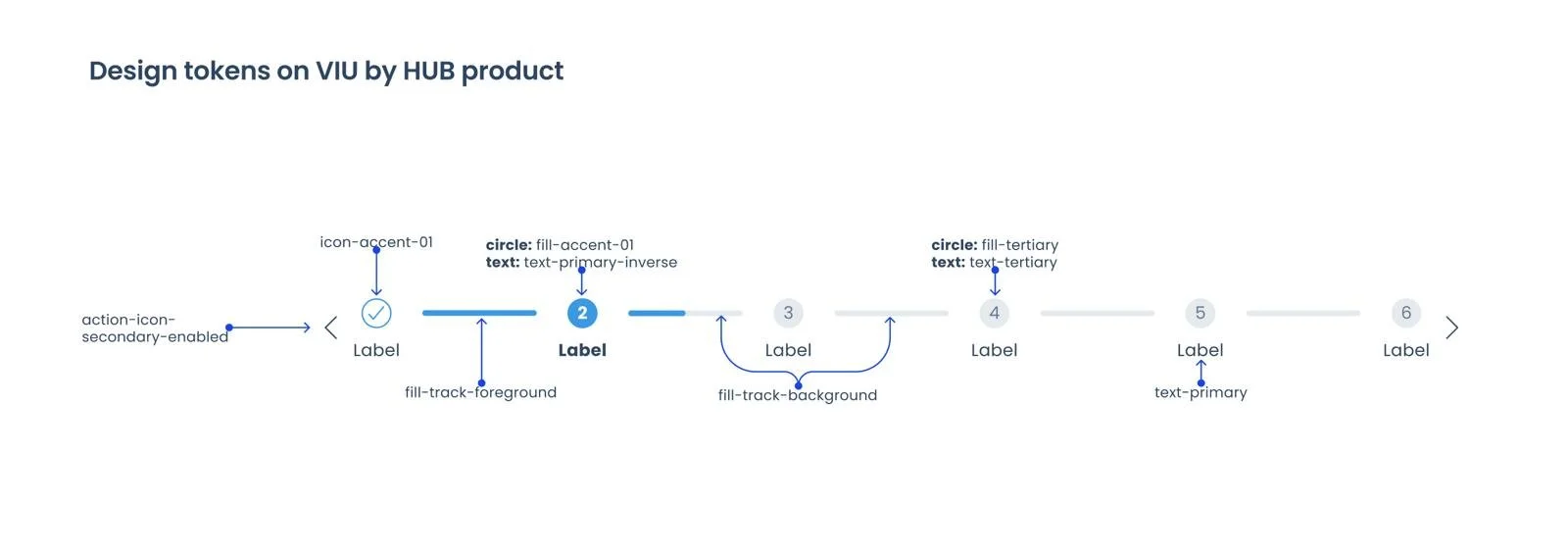
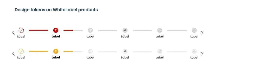
  4. The current indicator is Branded with VIU illustrated icons, it increases the complexity of private labeling for partners.

Goals:

  1. Research - Assess the user feedback and and discover the competitor’s progress indicator design, determine whether it is necessary to build a new design.

  2. Redesign - If it is necessary to rebuild a new progress indicator, make that can be used for all platforms.

Timeline:

  1. Research - 1 month

  2. Redesign - 5 months

  3. Development - 2 months

Context

Product VIU by HUB — Progress Indicator

The existing progress indicator had usability issues and was tightly coupled to VIU's branded illustrations — making it impossible to scale across white-label partners like Honda and Valon. A full research-to-redesign process was needed to build a component that could work globally across all products and brands.

Research · Redesign · Shipped

Details

Role Product Design Lead
Team Product, Tech, Design
Scope UX Research, Component Redesign, Design System, Accessibility
Timeline Research 1 mo · Redesign 5 mo · Dev 2 mo

Problem & Challenges

01

Usability Gaps — Mixed User Feedback

The component received mixed feedback and couldn't accurately reflect dynamic flows where each section may contain multiple subsections — leaving users without a clear sense of progress.

02

No Way to Signal Blocked States

When information prevented a user from progressing, the component had no mechanism to communicate process termination — creating confusion and silent dead ends in the flow.

03

Scalability Ceiling

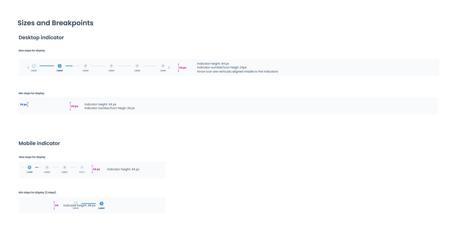
Each section is dynamic with possible multiple subsections, but the indicator had no way to communicate depth or progress within a step — making the component fundamentally non-scalable.

04

Brand Lock-in Blocked White Labeling

VIU's illustrated icons were embedded in the component, making it incompatible with private label partner requirements and blocking adoption across Honda and Valon.

My Strategic Approach

Approach

Research first, then redesign

Rather than jumping straight to a new design, I structured the work in two deliberate phases — starting with a month of research to assess whether rebuilding was even necessary, then five months of design iteration to produce a globally adoptable, brand-agnostic component that works across all products and white-label partners.

Goal 01

Research

Assess user feedback and competitor designs. Determine whether a rebuild is necessary or if the existing component can be iterated.

Goal 02

Redesign

Create a progress indicator that is usable across all platforms and adoptable by all white-label partners without per-brand modifications.

Impact & Result

↓ Complaints

User Satisfaction

Long-standing usability pain point resolved post-launch

3 Brands

White-label Adoption

Deployed across VIU, Honda, and Valon without modification

WCAG AA

Accessibility Standard

High contrast met across all component states 💖


1. Research & discovery phase

Competitive research

The full research work was compiled within Figma and completed within one week. The competitor brands include: Lemonade, Zebra, Travelers, Geico, Progressive, Allstate, etc.

View full research on Figma


Considerations:

  1. Consider icon style, color, and illustration. Avoid complex designs that could cause style inconsistency throughout the flow.

  2. Consider the progress indicator’s interaction, whether it should be interactive or non-interactive. If interactive, avoid any uncommon or complex design.

  3. How might we avoid user frictions and confusions during the flow? Would it be better not to enable the user to click on the indicator? Consider whether the interactive action is necessary.

  4. Ensure that the same design flow is used across all insurance products.

What to avoid:

  • Avoid using confusing or imprecise copy that misleads users' decisions or create a negative impression.

  • Avoid using different design flows and indicators for different products; all products should provide consistent experience to save users' learning time. This can also be a problem for the multi-branding design.

  • Avoid using too many elements in the progress bar as this can cause misalignment on mobile devices.


Key Research Takeaways

  • In general, horizontal designs are more commonly applied in the industry, typically divided into 4 to 5 steps.
  • In general, sub-sections are not directly displayed through the main indicator. Designers should consider incorporating design elements that can indicate the presence of sub-sections, so users are clear about their current position within the process.
  • Frequently using pop-up modals could interrupt users and prevent them from progressing to the next step in their workflow.
  • Icons are usually not involved in the progress indicator; the group [text + indicator(dots/line)] is the most common pattern.
 

2. Design exploration

Overview of proposed new progress indicator

After UX research and discussions with the team, we agreed to modify the current version and explore a new design. The new indicator should answer the current UX issues and enable the multi-brand design system for white-label products. Typography, color, spacing, and the various states of the indicators must be taken into consideration.

Additionally, several logical questions need to be explored beforehand:

e.g. Should we inform users about the remaining steps?

e.g. What would be the best experience for users when they want to go back?


Snippets of design options

A couple of options were proposed during the design iteration. I came up with both non-interactive and interactive solutions. After speaking with the design and dev teams, we concluded that a non-interactive design would be more appropriate, as users can navigate through the process using the "Go back" or "Next" buttons. Making the steps clickable/interactive would involve using multiple colors to showcase different states, which might cause confusion for users. In addition, we could use the progress bar to display the progress within each step.

 
× Snippets of interactive design options


Iteration outcome

A non-interactive live progress indicator that can show the state of each step and the progress within each step.

Full width image
Full width image
 

3. The Solutions

Design changes and the rationales:

Design change 1: Add a sub-step progress bar to indicate the current status within each step

A sub-step progress bar is a common component and provides visibility into the progress.In current quote flow, users need to go through multiple steps before they reach to the next step.The sub-step indication can keep users always informed and reduce the abandon rate.

Design change 2: Replace the illustrations with the checkmark icon and numbers in the indicator

The current illustration is VIU by Hub branded, which will cause trouble if the flow is white-labeled to other brands. The component should be as brand-agnostic as possible, considering its scalability and consistency.

Using step number as an indication and when the step is completed turn it into a checkmark icon to differentiate other incompleted steps.

Design change 3: Change the current interactive action to non-interactive behavior

The current indicator allows users to navigate back to the previous step by selecting the "Back" button on the web page. On mobile, users must use the browser's back icon instead. This interactive behavior adds no extra value and may confuse users when navigating back and forth through the process.

Design change 4: Apply design tokens to the new progress indicator

Without confirming the function of each element, it is difficult to apply the correct design tokens, as there are separate tokens for non-interactive and interactive states. Now that we have decided to go with non-interactive behavior, the appropriate design tokens can be applied to the progress indicator.

Design change 5: Use high contrast color to differentiate current, completed, and incomplete steps

Ensure that the color contrast meets WCAG AA standards, with particular attention to disabled indicators, making sure they remain visible even in a disabled state.

4. Final outcome

Anatomy (color, typography, component status)

Transition and behaviors

  • This progress indicator is non-interactive.

  • Once a step is completed, the step number will be replaced with a blue checkmark icon.

  • When a user is on an active step, the indicator turns blue and the step label becomes bold.

  • If a step has not been completed — whether the user has gone back to a previous step or has not yet reached it — the indicator will appear as an outlined circle with a white background.

  • On mobile, the indicator is horizontally scrollable without arrow icons on the sides, allowing users to scroll through and view their progress.


Applying design tokens

Applying VIU by HUB token colors to the component

Applying token colors to white label partners Honda and Valon.


Mobile and Desktop breakpoints


 5. The impacts

Customer satisfaction impact

  • The redesign has resolved a long-standing user pain point — the progress indicator now accurately reflects users' advancement through each step, eliminating the perception that the indicator was broken.

  • Customer complaints regarding the progress indicator have dropped significantly following the redesign, which has improved user retention.

  • The updated indicator introduces sub-steps, giving users better visibility into the full scope of the process — addressing the previous misconception that only four steps existed.

  • The clearer step structure gives users a more accurate sense of progress, reducing confusion and improving their overall confidence when navigating the flow..

Business impact

  • The redesigned component is brand-agnostic and scalable across varying numbers of steps, ensuring seamless compatibility with white-label partners without requiring per-brand design modifications.

  • The improved user experience has contributed to an increase in website traffic, reflecting greater user engagement and flow completion.

My highlights

Throughout this redesign, I had full ownership of the project — from initial research and strategic thinking to cross-functional collaboration and final design delivery. Here is a breakdown of the highlights:

  • Strategic thinking — The redesign is connected to real business goals and user outcomes, not just visual changes.

  • Systems thinking — The component was designed for reusability, scalability, and long-term maintainability within a design system. Without putting all of these into consideration, the design ecosystem would be inconsistent.

  • Quantified impact — Outcomes are expressed in measurable results, such as reduced complaints and increased website traffic.

  • Cross-functional collaboration — Key decisions, such as removing interactive behavior, were made in alignment with product and development teams.

  • Accessibility as a standard — WCAG AA compliance was treated as a non-negotiable requirement, not an optional enhancement.

  • Considered trade-offs — Interactive navigation was evaluated and deliberately removed to reduce cognitive load and avoid redundancy with existing browser behavior.


Thanks for reading!